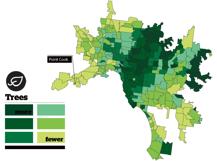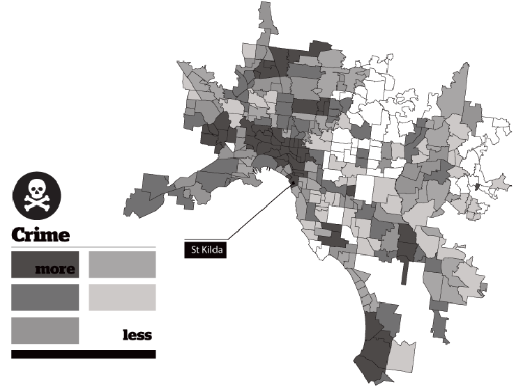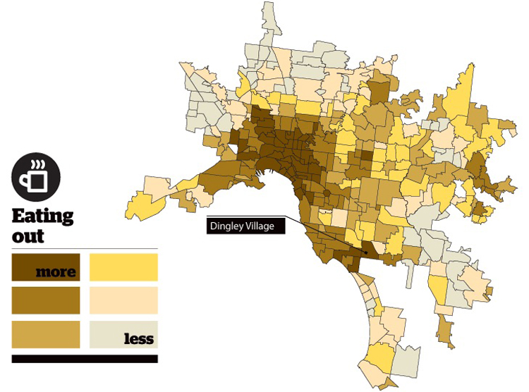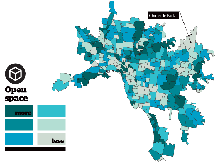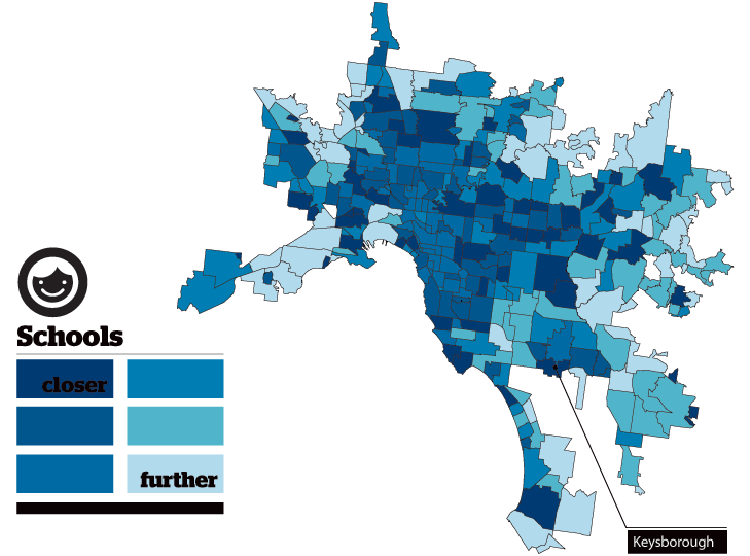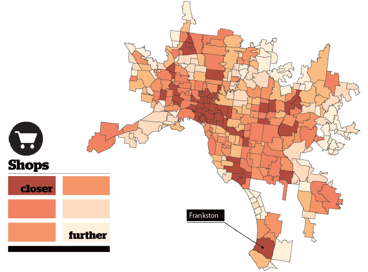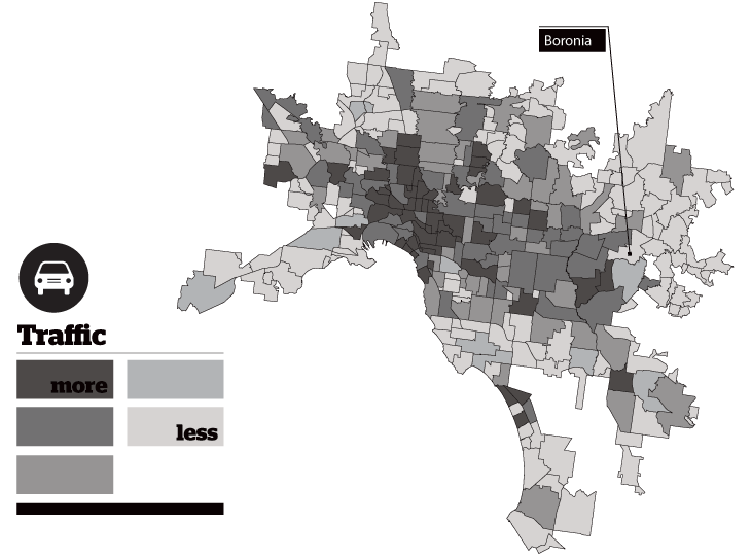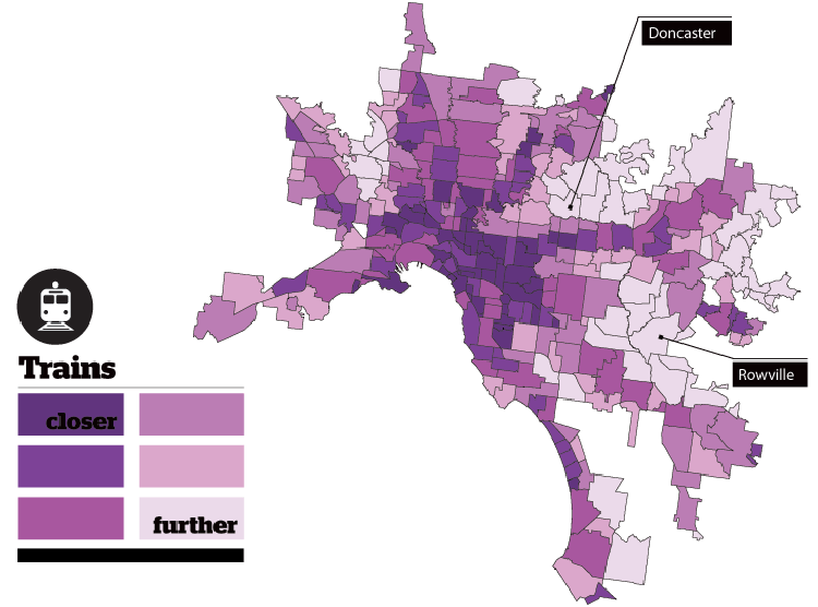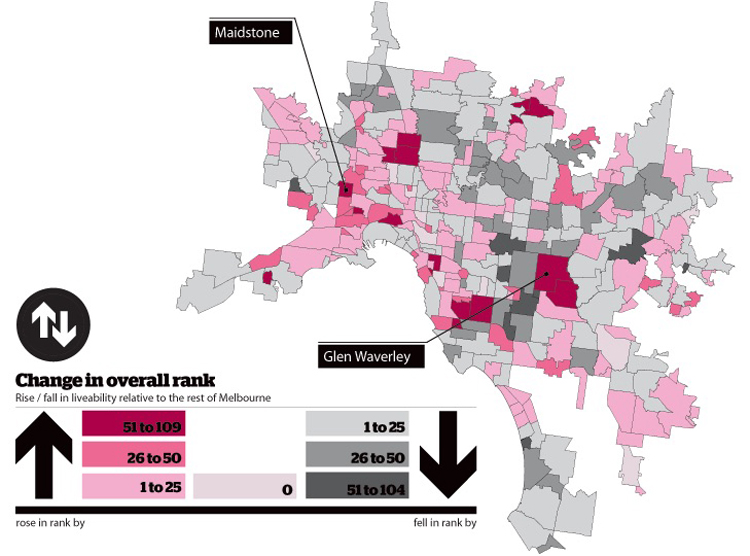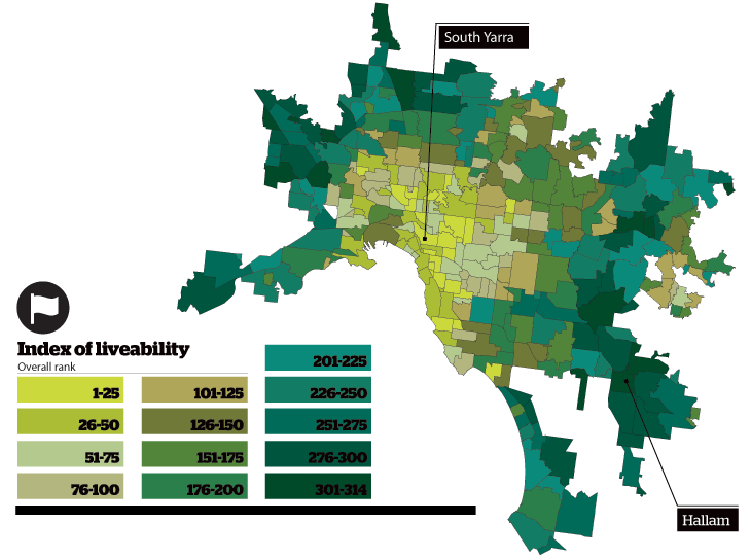
I was digging through my files and found these maps, that look at indexing the liveability of Melbourne. The graphs are super simple however they’re from 2011 so I hope The Age re-does them again sometime in the near future. Lets assume the research behind them is sound, they indexed each suburb according to a bunch of fair criteria and named the best and worst suburbs according the statistics, follow the jump to see each one.
