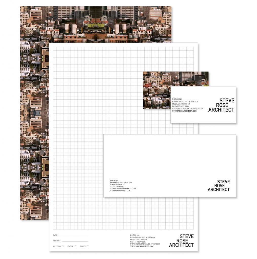
When starting a new architectural practice, the first few years you tend to keep things as lean as possible. One tactic is to delay the fees associated with a graphic designer, use basic self designed letterheads with no logo or company identity. This quickly grows old and begins to look unprofessional. That all changed when I hired my designer to tackle a new ID for the business.
It was an interesting process being a designer myself, my first reaction was to try really hard to be the best client that I could be, I soon realised this is a hard role to fill. Once we got over that hurdle the process was smooth and the outcome was excellent.
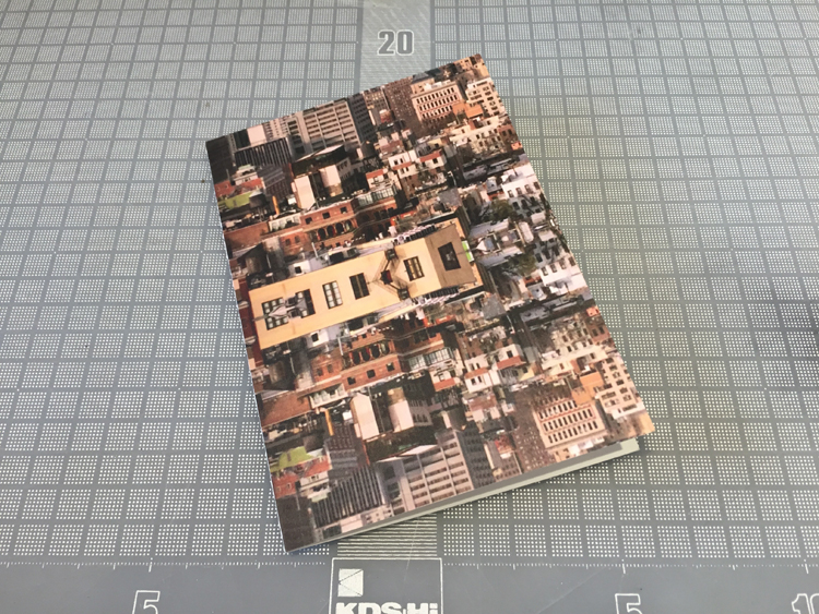
The package started with a new logo & ID imagery. The first deliverable was the obligatory business card (these got thicker with each reprint). I’m a bit of a traditionalist so I asked for some ‘with compliments’ slips & a classic letterhead. Emails and PDF’s are becoming commonplace so I opted for a pre-printed backing image rather than a printed front, this provided flexibility so the front was ‘in the file’. The imagery is now part of my ID and something that runs through items like card holders, tape measures etc. My designer also took on some gridded pads, drawing titles and set out all my word processing templates. Check out my Christmas card here, another use for the ID. A company identity is an important step and I’m really glad I took it.
Many thanks to Richard Blackman of RBD.
