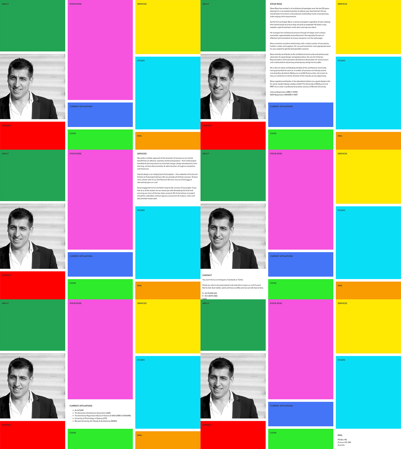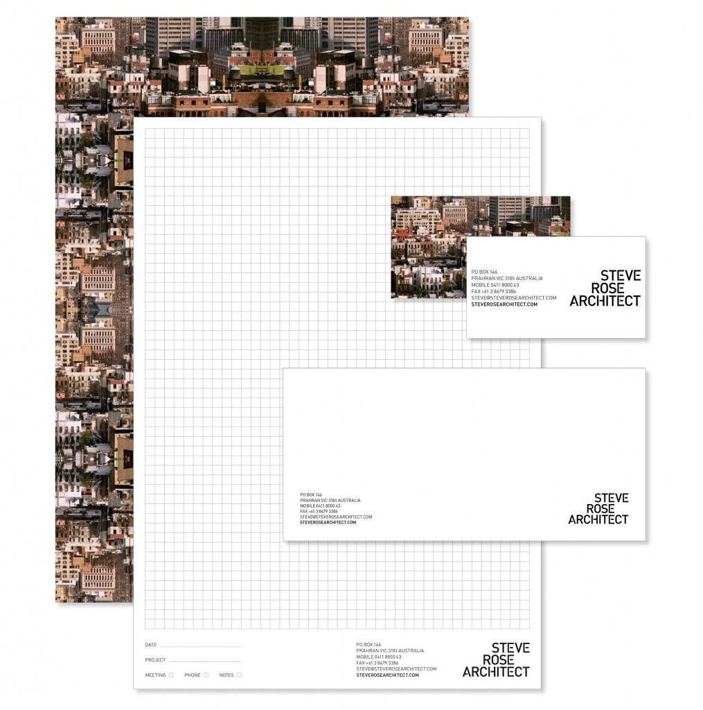
We have a new website which you probably know as you’re looking at it right now. Updating your site should be a pretty regular thing, I’d say 5 years is the maximum you’ll get out of it before a refresh is required. I’m not saying I didn’t like my old one but a change is as good as a holiday. I went back to my favourite web designer Pixelshifter and he delivered in spades. The brief was to simplify simplify simplify.
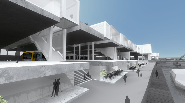
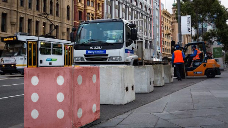
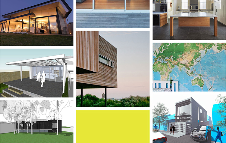
I liked the idea of having as few pages as possible and we settled on 3 which matched our menu design. A main projects page, an about page and a journal. Similar to my last website all the relevant information has been reformatted to make it easy to access and also look amazing. Projects are easier to view in iOS and the journal page is way better to view a bunch of stuff all at a glance with a neat little search function that I use all the time.
In case you get lost we have another little custom 404 page so you can find your way home. Pixelshifter is awesome, go see him here.
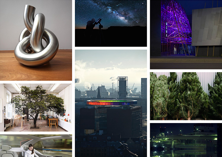
Journal above and our about page below, all formatted in the same way for continuity.
